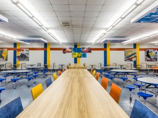
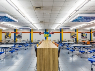
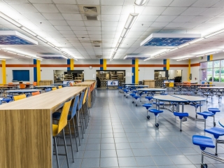
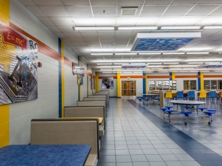
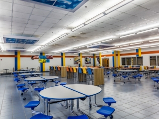
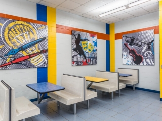
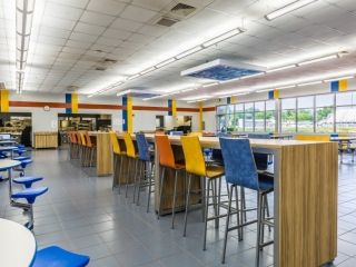
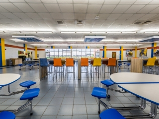
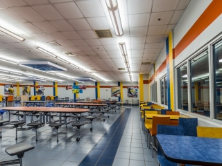
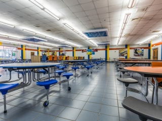
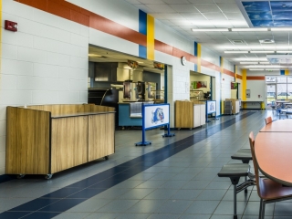
The goal behind the Hazelwood Middle School project was to turn the cafeteria from plain and boring to fun, and energizing. Changes in graphics, seating, traffic, and lighting transformed Hazelwood’s cafeteria dark and gloomy to bright and roomy.
Hazelwood Middle School
Graphics
White walls and a lonely mascot graphic were all that adorned the cafeteria walls pre-transformation. Graphics and lively colors enhance the overall space with artwork that showcases the various sports and scholastic activities that students are involved in.
Seating
Navy and grey fixed seating previously filled the cafeteria, leaving the space looking dull and dated. Varied seating maximizes the space while adding additional pops of color. The featured mobile seating can be easily moved for cleaning and storage purposes.
Traffic
Prior to the transformation, traffic was directed by open trash cans and ropes. Millwork conceals the trash cans and provides additional storage. Custom crowd control panels redirect traffic flow and display the school mascot, Go Bullpups!
Lighting
To bring the outside natural world in, suspended soffits featuring cloud images were hung throughout the center of the space. Soffits featuring graphics are a fun way to brighten any cafeteria space from floor to ceiling.
(see original article with Before/After photos on Seating Concept’s Website)

